Time After Time


Funky wedding invites and stationery suite

Made up of a retro-inspired font and the iconic arches pattern, Time After Time can be modified to accommodate any colour palette, details and finishes to make it yours.
If the arches face up, they look very Art Deco, but downwards they’re reminiscent of feathers, waves or raindrops. The pattern is really versatile, so whether you’re going for vibrant rainbow mix of tones or the ever-classic monochrome look, it’ll work wonderfully. The layout is flexible, so you can easily get the look you’re going for and match the style of your wedding.
The font is friendly, decorative and has plenty of unique personality, without being overly fussy. It is easy to read and looks beautiful spelling out any name!
Pick me if your wedding is
Classic • Art Deco • Clean and fresh
Named after
Time After Time by Cyndi Lauper. Anyone else close their eyes and throw their fist into the air when singing that bit that goes ‘I will be waiting!’? No? Just me.

More than just invites, Time After Time is a design that can take you from the beginning of your engagement, right through to your wedding day. It includes:
Save the dates
Invitation cards
Information cards
RSVP cards
“Will you be my…” cards
Welcome signs
Order of service sheets or booklets
Table plans
Table numbers or names
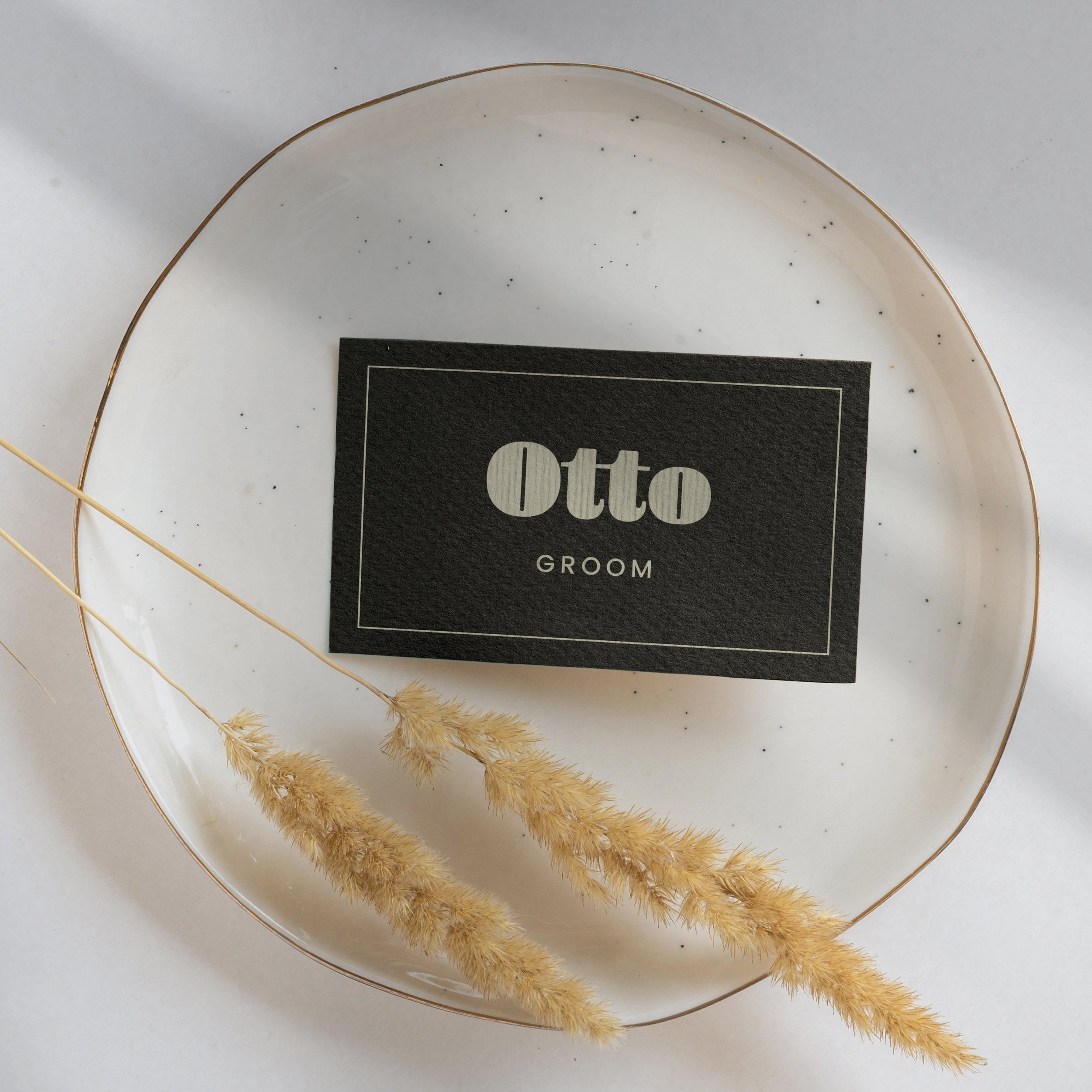
Place names
Escort cards
Menus
Thank you cards

How does ‘customisable’ stationery work?
All of the sets act as the foundation for the whole of your wedding stationery design suite. You can change the colours, words and format of any of them to create something that is unique to you. It’s quicker and costs less than bespoke designs but packs just as much of an offbeat punch!


How do I choose a style for my wedding?
Whatever it is, the way you tell your story online can make all the difference.

What does that mean?! A handy glossary
Whatever it is, the way you tell your story online can make all the difference.
